(Blog) · Guides
Dark Mode Website Design: Contrast, Colour and Type That Work
Dark mode is more than inverting colours. Learn how to choose backgrounds, handle contrast and typography, and avoid the common mistakes when designing a dark website.

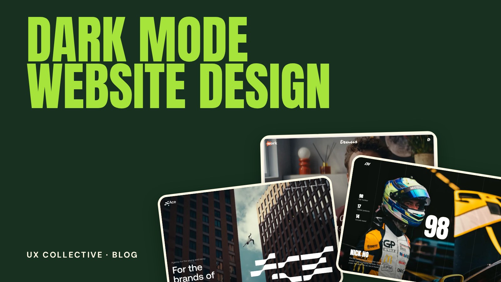
A dark website can look striking, premium and focused. It can also be tiring to read, flat and hard to use if it is treated as a colour inversion. Good dark mode website design is a set of deliberate choices about backgrounds, contrast, colour and type. This guide walks through each one, with the mistakes to avoid.
New to studying websites this way? Start with the full guide to web design inspiration, then come back for the details.
Dark theme or dark mode: which one are you designing?
These are related but different. A dark theme is a site designed dark from the start, as part of the brand. A dark mode is an alternative version of a light site that visitors can switch to, or that follows their device setting. A dark theme gives you full creative control. A dark mode asks you to maintain two coherent designs.
Choosing the background
- Avoid pure black for large areas. A very dark grey, or a dark tone of your brand colour, is easier on the eyes and feels richer.
- Add depth with lighter surfaces. Shadows are hard to see on dark backgrounds, so raised elements such as cards and menus are usually a little lighter than the page behind them.
- Use subtle borders. A thin, low-contrast line can separate sections more cleanly than a shadow.
Contrast and readability
Contrast is the first thing to test. WCAG recommends a ratio of at least 4.5:1 for normal body text and 3:1 for large text. On dark designs the risk runs both ways: grey text that is too dim, and pure white text that is so bright it glows and strains the eyes.
- Use off-white for body text instead of pure white, and reserve the brightest tone for headings and key actions.
- Check every grey. Secondary text, placeholders and disabled states are the most common failures.
- Do not rely on colour alone to show errors, links or status. Add icons, text or underlines.
Colour on dark backgrounds
Colours look different on dark. Saturated tones can vibrate and feel harsh, while muted tones can disappear. Often the accent colour needs to be slightly lighter or less saturated than its light-mode version. Pick one strong accent for actions and keep the rest of the palette quiet, so the accent keeps its power.
Typography on dark
- Light text on dark appears bolder. Thin weights can work for headlines, but check body text at small sizes.
- Add a little extra line height and letter spacing to long paragraphs for comfort.
- Keep line length moderate. Wide blocks of bright text are tiring.
- Test your typeface in both modes. Some fonts feel perfect on white and cramped on black.
(Dark designs worth studying)


Images, logos and illustrations
Assets made for a white background often break on dark. Logos with dark text disappear, screenshots with white backgrounds glare and shadows look wrong. Prepare light versions of logos, consider softening bright images with a subtle overlay and check that transparent images still look right.
Respect the visitor's choice
- Follow the device setting with the prefers-color-scheme media query when you offer both modes.
- Offer a visible toggle and remember the choice.
- Avoid a flash of the wrong theme on page load by applying the theme before the page renders.
Common dark mode mistakes
- Simply inverting colours. The result is rarely balanced. Design the palette for dark on purpose.
- Pure white on pure black. The extreme contrast causes glare, especially for long reading.
- Forgetting states. Hover, focus, disabled and error states all need their own dark treatment.
- Dark mode only on the homepage. Forms, tables and settings pages are where inconsistencies show up.
- No testing in real conditions. Check on a phone, in a dim room and in daylight.
Dark mode website design: frequently asked questions
Is dark mode better for the eyes?
It depends on the person and the environment. Dark designs can be more comfortable in low light, but they are not automatically easier to read. Good contrast and a well-chosen text colour matter more than the mode itself.
What background colour should I use for a dark website?
Start with a very dark grey or a deep tone of your brand colour instead of pure black. Use slightly lighter surfaces for cards and menus so the layout still has depth.
How do I check contrast in a dark design?
Use a contrast checker on every combination of text and background, including secondary text, placeholders and buttons. Aim for at least 4.5:1 for body text and 3:1 for large text.
Should every website offer a dark mode?
Not necessarily. It is valuable for products people use for long periods or at night. For many sites, a single, well-made theme is better than two half-finished ones.