(Blog) · Guides
SaaS Landing Page Design: What the Best Ones Have in Common
Great SaaS landing pages follow a surprisingly similar structure. Learn the sections they use, how to show a product instead of describing it and where most pages go wrong.

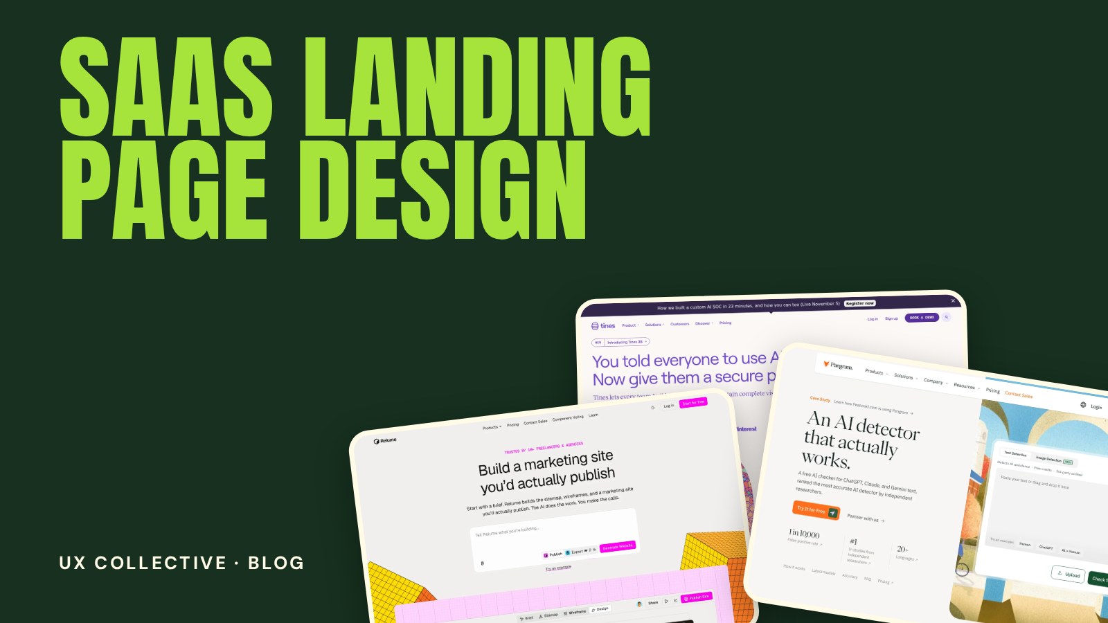
Open ten great software websites side by side and you will notice something: they look different, but they are built the same way. SaaS landing page design is less about inventing a layout and more about getting a proven structure right. This guide covers that structure, how to show a product instead of describing it and the mistakes that quietly cost sign-ups.
New to studying websites this way? Start with the full guide to web design inspiration, then come back for the details.
Start with one visitor and one job
A landing page is not your whole website. It has one audience and one goal, such as starting a free trial or booking a demo. Before you design anything, write down who the visitor is, what problem they arrive with and what single action you want from them. Every section that follows should move them closer to that action.
The structure that keeps coming back
Most strong SaaS pages follow roughly this order. You can reorder or merge steps, but you should know what each one is for:
- Hero. A clear promise, one call to action and a first look at the product. See hero section examples.
- Social proof. Customer logos, ratings or a short quote, placed early so the claim feels believable. See social proof examples.
- The problem and the outcome. One short section that shows you understand the pain and what life looks like afterwards.
- Features, grouped by benefit. Three to six blocks, each tied to a result rather than a technical detail. See features section examples.
- How it works. Three simple steps that make the product feel easy to start. See how it works examples.
- Pricing or a path to pricing. Visitors want to know roughly what it costs. See pricing page examples.
- FAQ. Answer the objections that stop people from signing up. See FAQ section examples.
- Final call to action. Repeat the primary action for visitors who scrolled to the bottom.
Show the product instead of describing it
The weakest SaaS pages are full of adjectives: powerful, seamless, all-in-one. The strongest ones show the interface early and let it do the talking. A real screenshot, a short looping clip or an interactive demo tells visitors more than a paragraph of claims.
- Crop to the moment that matters. A full dashboard is overwhelming. Show the one screen that solves the headline problem.
- Add short labels or callouts so visitors know where to look.
- Use real data in mockups. Placeholder text like "Lorem ipsum" or "John Doe" makes the product feel unfinished.
- Keep it crisp on every screen. Test the screenshot on a high-density mobile display.
(Software sites worth studying)


Build trust before you ask for the sign-up
Visitors are being asked to hand over an email address or a credit card. Trust signals reduce that friction:
- Recognisable customer logos, ideally from the audience you are targeting.
- Specific testimonials with a name, role and a concrete result instead of generic praise.
- Security and compliance notes where they matter, such as for finance or health software.
- Low-risk language near the button, such as "No credit card required" or "Cancel anytime", when it is true.
Common SaaS landing page mistakes
- Talking about yourself. "We are a platform that..." makes the visitor work. Start with their problem.
- Feature lists with no benefit. Every feature should answer "so what?" in one line.
- Several competing calls to action. One primary action per page, repeated, beats five different ones.
- Hiding the price entirely. If you must ask for a conversation, still explain who the product is for and roughly what to expect.
- A slow page. Heavy scripts, large videos and unoptimised images hurt both conversion and search ranking.
- Ignoring mobile. A large share of first visits happen on a phone, so check every section there first.
SaaS landing page design: frequently asked questions
What should a SaaS landing page include?
At minimum: a clear headline and call to action, a first look at the product, social proof, the main benefits, a simple explanation of how it works, pricing information and a short FAQ. The exact order depends on your audience and how well they already know the problem.
How long should a SaaS landing page be?
As long as it takes to answer the visitor's questions and no longer. A simple, low-commitment product can work with a short page. A complex or expensive product usually needs more sections for proof, detail and objections.
Should a SaaS landing page show pricing?
Whenever possible, yes, or at least a clear route to it. Visitors who cannot find the price often leave to look at a competitor. If pricing is custom, explain what influences it and who the product is for.
How do I find good SaaS landing page examples?
Study a curated selection rather than an endless feed, and compare the same section across several sites. The SaaS category in the UX Collective is a good place to start.