(Blog) · Guides
Minimalist Website Design: Principles, Examples and Pitfalls
Minimalist web design is about removing everything that does not help the visitor. Learn the principles behind clean, simple websites and how to avoid making a design empty instead of clear.

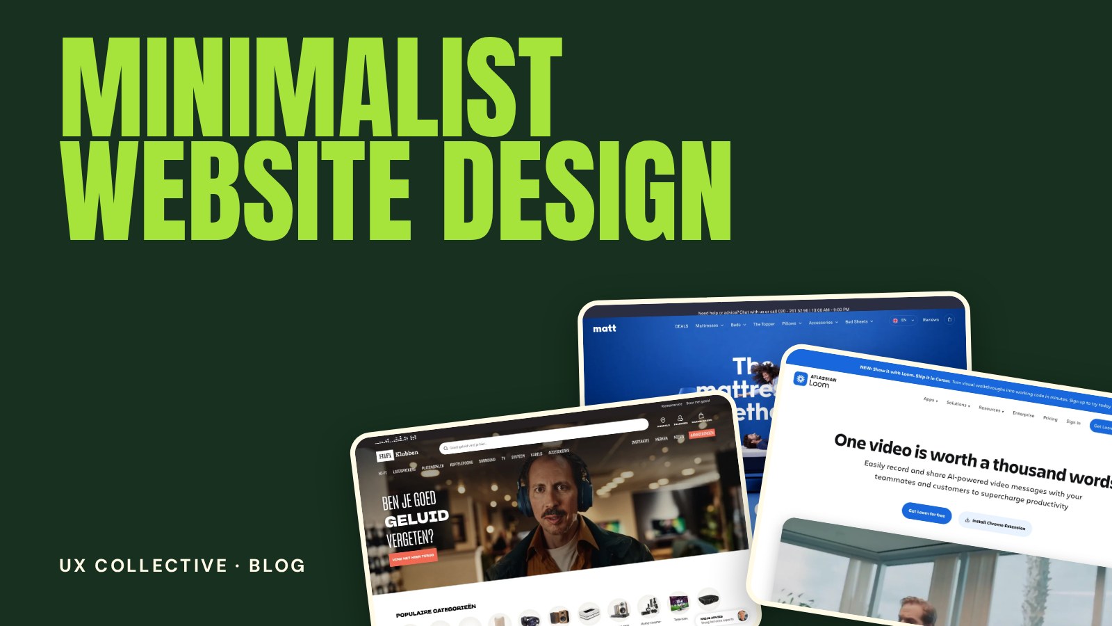
Minimalist website design is not about using less for the sake of it. It is about keeping only what helps the visitor, and making that part excellent. Done well, a minimal site feels calm, fast and confident. Done badly, it feels empty and confusing. This guide covers the principles that make the difference, with ideas you can apply to your next design.
New to studying websites this way? Start with the full guide to web design inspiration, then come back for the details.
What minimalist web design really means
Minimalism is a decision about priorities. Every element on the page has to earn its place by supporting the main goal. What remains is then given room to breathe. The result is not a lack of design, but design that is concentrated in fewer places.
Five principles of minimalist website design
1. Use whitespace as a design material
Whitespace is what creates hierarchy, rhythm and focus. Generous space around a headline makes it feel important. Tight space groups related items. Treat empty areas as deliberate choices, and be consistent with the spacing scale you use.
2. Let typography carry the page
When there are few images and decorations, type does most of the work. Choose one or two typefaces, use a clear size jump between headings and body text, and keep line lengths comfortable. A strong typographic system makes a simple page feel designed.
3. Limit the colour palette
Use neutral tones for most of the page and one accent colour for what matters, such as buttons and links. A restrained palette makes the accent stand out and keeps the page consistent.
4. Give every page one main action
Minimal pages work because they make the next step obvious. Decide what the primary action is, and let the layout lead to it. Secondary actions can exist, but they should look quieter.
5. Make fewer elements better
With less on the page, each piece gets more attention. Use sharp photography, well-aligned layouts and carefully tuned details such as hover states and spacing. Small imperfections that would be hidden on a busy page become visible on a simple one.
(Simple, clean sites worth studying)


Pitfalls of minimalist design
- Mistaking empty for clean. If visitors cannot tell what the site does, there is too little on the page, not just the right amount.
- Low contrast. Light grey text on a white background looks refined and reads poorly. Check contrast, especially for body text.
- Hidden navigation. Collapsing everything behind a menu icon on desktop hides options that visitors need.
- Weak calls to action. A button that blends into the page is not minimalism, it is a missed opportunity.
- No personality. Removing decoration should not mean removing character. Tone of voice, photography and type choices can still make a brand recognisable.
How to design a minimalist page step by step
- Write down the one goal of the page and the one thing the visitor should remember.
- List every element you think you need, then remove half and see what breaks.
- Set the typography first, with sizes, weights and a spacing scale.
- Choose a neutral base and a single accent colour.
- Add imagery only where it supports the message, and make it high quality.
- Test on a phone. Minimal layouts often shine there, but only if spacing and tap targets hold up.
Minimalist website design: frequently asked questions
What is minimalist website design?
Minimalist website design is an approach that removes everything that does not support the visitor's goal. It relies on whitespace, strong typography, a restrained colour palette and a clear primary action.
Is minimalist web design good for conversion?
It can be, because fewer distractions make the main action more obvious. It only works when the message and the call to action are clear. A page that is minimal but vague will convert worse than a busier one that explains the offer well.
Which businesses suit a minimalist website?
Many do. It is common for software, portfolios, premium products and design-led brands. Businesses with a lot of information, such as large shops, can use the same principles by keeping the interface calm and the structure clear.
How do I keep a minimal website from looking boring?
Put your effort into details: distinctive typography, confident spacing, a bold accent colour and thoughtful motion. Personality comes from choices, not from quantity.