(Blog) · Guides
Hero Section Design: What Makes a Website's First Screen Work
A hero section has a few seconds to explain who you are and what to do next. Learn the anatomy of a strong hero, five layouts worth studying and the mistakes to avoid.

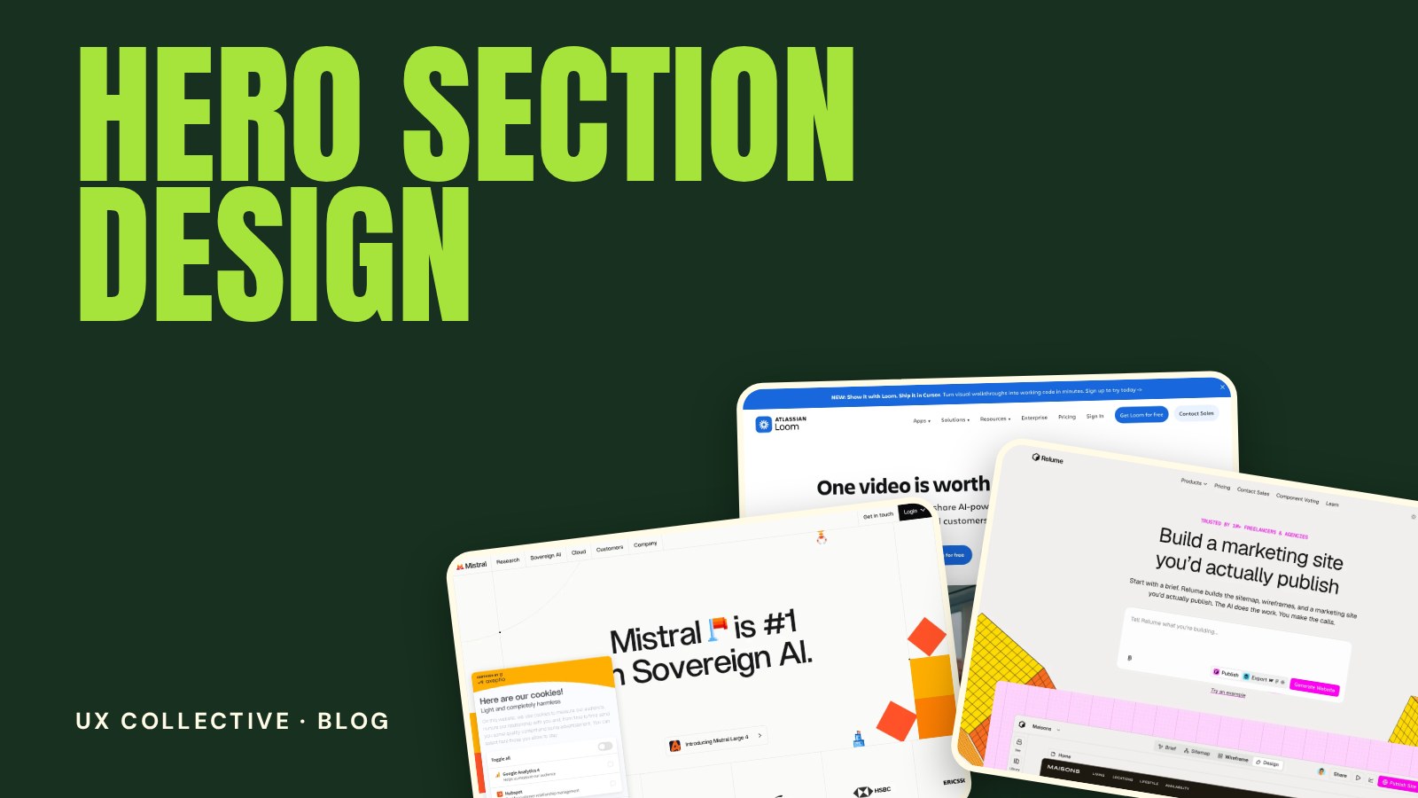
The hero section is the first thing every visitor sees, and it decides whether they scroll or leave. A good hero section design answers three questions in a few seconds: what is this, who is it for and what should I do next. This guide breaks down what a strong hero contains, five layouts worth studying and the mistakes that make a first screen fall flat.
New to studying websites this way? Start with the full guide to web design inspiration, then come back for the details.
What a hero section has to do
A hero is not a poster. It is the shortest possible version of your whole website, and it has to do three jobs at once:
- Explain the offer. A visitor should understand what you do without scrolling or guessing.
- Signal who it is for. Specific language filters the right people in. Vague language lets everyone drift past.
- Point to one next step. The hero is where the main call to action lives, so it needs to be obvious.
The anatomy of a strong hero
Almost every effective hero is built from the same few parts. You can leave some out, but you should be able to explain why:
- Headline. The single most important sentence on the site. It should be readable in one glance and say something only you can say.
- Subheadline. One or two lines that add the detail the headline leaves out, such as who it is for or how it works.
- Primary call to action. One clear button with a verb that describes the outcome, such as "Start free" or "See the work".
- Secondary action. An optional, quieter link for visitors who are not ready yet, for example "Watch the demo".
- Visual. A product screenshot, photo, illustration or video that supports the message instead of decorating it.
- Proof. A row of logos, a rating or a short quote that makes the claim believable.
Five hero layouts worth studying
The centred statement
A large headline, a short line of support and one button, all centred. It works when the message is strong and the product is easy to explain. The risk is that it can look generic if the words are not sharp.
The split hero
Text on one side, a product screenshot or image on the other. This is the default for software, because the visitor reads the promise and sees the product at the same time.
The full-bleed image or video
A photo or looping video fills the screen, with a short headline on top. It suits brands that sell an atmosphere, such as travel, hospitality and culture. Keep the text contrast high, and make sure the file does not slow the page down.
The typography-only hero
No image at all, just oversized type and strong spacing. It is fast, confident and memorable, but it only works when the typeface and the copy are good enough to carry the page alone.
The demo-first hero
The hero is the product: an interactive widget, a live preview or an input field. Visitors learn by doing, which is powerful when the product can be understood in one action.
(First screens worth studying)


How to write a better hero headline
- Lead with the outcome, not the feature. People buy the result, not the mechanism.
- Be specific. "Schedule meetings without the back and forth" beats "The future of scheduling".
- Keep it short. Aim for under ten words. If you need more, move the extra detail to the subheadline.
- Read it out loud. If it sounds like something nobody would say, rewrite it.
- Test it on a stranger. Show the first screen for five seconds and ask what the site does.
Common hero section mistakes
- Clever instead of clear. A witty headline that hides the offer costs you the visitors who do not have time to decode it.
- Too many buttons. Three equal calls to action are no call to action. Pick one primary.
- Stock imagery that says nothing. If the image could belong to any company, it is not helping.
- Low contrast text on an image. Check legibility on a phone outdoors, not just on your monitor.
- A hero that is too tall. If the next section is not hinted at, visitors may not realise there is more below.
- Autoplaying media that blocks loading. A heavy video can delay the very first thing visitors see.
A quick hero section checklist
- Can a stranger say what the site does after five seconds?
- Is there exactly one primary call to action?
- Does the headline name an outcome or a specific audience?
- Does the visual show the real product or work?
- Is the text readable on a small screen without zooming?
- Does the hero load fast on a mobile connection?
Hero section design: frequently asked questions
What is a hero section on a website?
The hero section is the first, full-width block of a page, usually containing the main headline, a short supporting line, a call to action and a visual. It is the part visitors see before they scroll.
How tall should a hero section be?
There is no fixed height. What matters is that the headline and call to action are visible without scrolling on common screen sizes, and that something hints at more content below. A hero that fills the screen is fine as long as it still makes the next section feel close.
Should a hero section use an image, a video or only text?
Use what explains the offer best. Software usually benefits from a product screenshot, experience brands from photo or video, and strong brands with sharp copy can work with type alone. Whatever you choose, keep it light enough to load quickly.
How many call to action buttons should a hero have?
One primary button is the goal. You can add a quieter secondary link, but if both look equally important visitors have to stop and choose, which lowers the chance that they act.